A visitors first impression of your website is everything. Which is where the appearance of your website design comes in to play as a top priority. You want your website design to pop out or else you can say sayonara to your visitors. The designs and pictures that worked a few years ago won’t necessarily ring with your visitors of today.
Our friends at Coastal Creative Reprographics have designed an infographic chart that will explain the big styles that swept the logo and website design industry this year, as well as the designs coming up next.
I’m going to give a brief personal opinion of each of these design trends for 2015 as well.
1. Huge and Beautiful Images
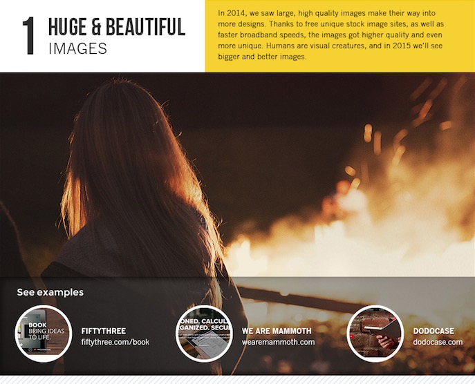
Boom! Once your website loads your visitors wants to see something attractive. Something big and beautiful. One thing you do not want to do with your landing page is bulk it up with text. A large slider or even one big and beautiful graphic or photograph can make that much of a difference.
2. Semi Flat Designs
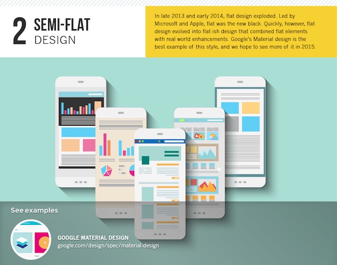
These designs are one of my personal favorites. The bright and colorful flat graphics bring life to your website as well as giving it a modern feel.
6. Rich Content Experiences
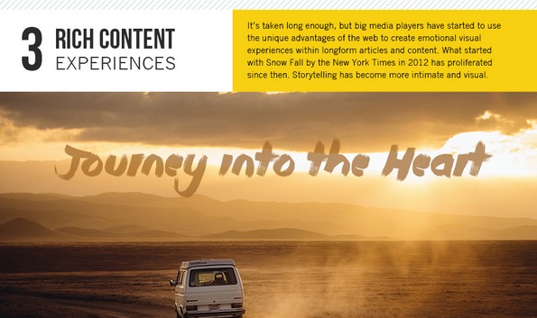
The video players in full width give life to your website. Sometimes it’s even more effective when its on autoplay but when you see a video you know your audience is going to click. Suck them in!
4. Better Typography
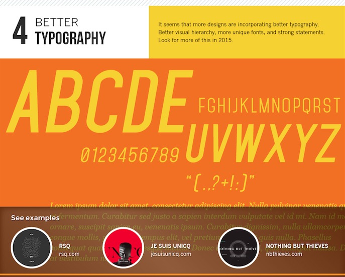
We’re getting sick of Times New Roman and Arial. As these fonts will always be around there are hundreds of new fonts being created each day. Spice it up with some new font styles.
And then we have the new trend predictions…
5. Magical Realism
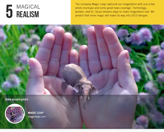
Like shown on the charts, Magicleap.com shows a perfect example of this trending magical realism effect and boy can I say I am digging it! It had me scrolling all the way to the bottom. Kudos.
6. Hand Drawn Illustrations
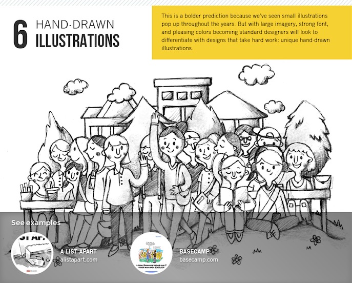
This is where the real artists come into play. Sketches on sketches on sketches we go. These bring some basic creatisim that you probably wouldn’t have thought of. Why? Because it’s not just text and graphics, its hand drawn on your screen… not paper.
7. Background Videos
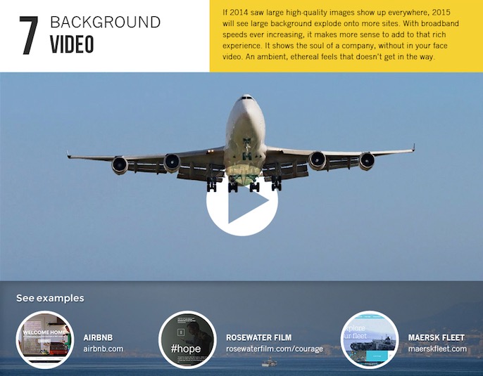
Relative to the rich content experiences, background videos are soon to be on every business website soon enough.
8. Cinema-graphs
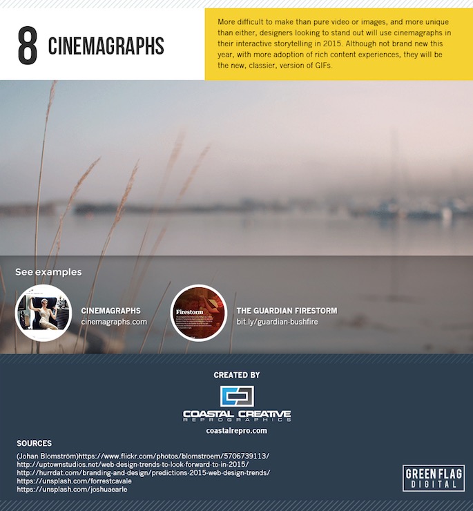
Talent. These take talent. I wanted to add a cinemagraph example below just to show you exactly how crazy cool these are. Bringing only some areas of the photo to life.

So, all in all if you don’t have one of the above design trends on your website you better get to it and upgrade your design.


