


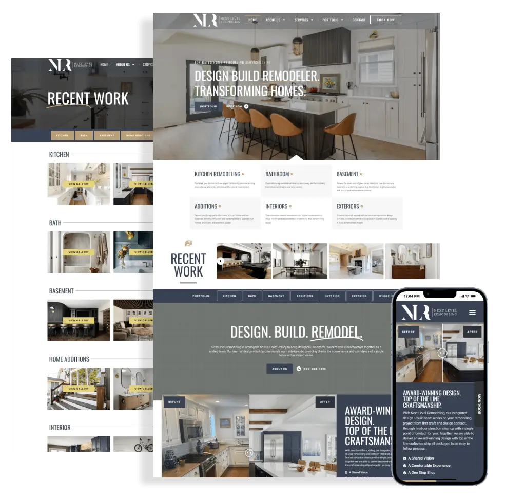
1. Your website is difficult to use on a phone
Open your website on your own phone and try to request a quote. Can you read the service description without zooming? Does the menu open cleanly? Is the phone number easy to tap?
A layout that technically fits a small screen can still feel awkward. Tiny buttons, oversized banners, and forms that run off the screen create unnecessary work for someone comparing local businesses.
What to improve: prioritize readable text, comfortable button spacing, short forms, and a clear contact option. Test the actual customer journey on mobile, not just a desktop preview.
2. Visitors have to guess where to go next
Your navigation makes sense to you because you know your business. A first-time visitor does not. Vague menu labels, crowded dropdowns, and important services buried several clicks deep can leave people unsure whether you offer what they need.
For example, a remodeling company should make it easy to find kitchens, bathrooms, and completed projects. A professional practice needs equally clear paths to services, provider information, and appointment inquiries.
What to improve: use familiar navigation labels and organize services around customer needs. Give each important service a useful page, then connect it to relevant work and a next step.
3. Your contact form creates friction—or loses inquiries
A form is not successful just because a submit button exists. Unnecessary required fields, unclear error messages, or missing confirmation text can make visitors abandon an inquiry. Email delivery problems can also leave genuine messages unseen.
What to improve: request only the information needed to start a conversation. Check the entire process: submission, confirmation, notification delivery, and your response workflow. Offer a visible phone option for customers who prefer calling.
When leads seem unusually quiet, inspect form records and email delivery before assuming nobody is interested. A redesign may help, but a broken form could be a smaller, more urgent fix.
4. Your project photos no longer reflect your best work
If the work you do today is stronger than the work shown online, your website may be underselling your business. Old images, stock-heavy galleries, and projects without any explanation give prospects little evidence of your current capabilities.
This matters for South Jersey service businesses whose customers compare several providers before reaching out. A useful portfolio helps people understand the type of work you handle and whether it matches what they have in mind.
What to improve: choose a few representative projects and explain the brief, your approach, and the completed work. Use genuine photos, helpful captions, and descriptive image alt text. Only state locations and results you can verify.
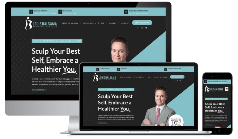
Our Next Level Remodeling basement project article illustrates this approach: room-by-room images and explanations give readers much more context than an unlabeled gallery.
5. Your calls to action are vague or easy to miss
Visitors should not have to decide what to do after reading about your services. A tiny contact link in the footer, or several equally prominent buttons competing for attention, can weaken an otherwise useful page.
What to improve: give each page one clear primary action. “Request a Website Quote” explains the next step better than “Click Here.” Place it where it follows naturally from the content, including after project examples and service explanations.
Make the action fit the customer’s stage of decision-making. Someone comparing providers may want to view your work before they are ready to fill out a form. A secondary portfolio link can support that journey without overwhelming the page.
6. Slow pages and visual glitches distract from your business
Large uncompressed images, unnecessary scripts, and poorly maintained plugins can make a website feel sluggish. Shifting content, broken images, or popups covering the page can also make basic tasks frustrating.
What to improve: review important pages on mobile and use a performance test to identify specific problems. Resize and compress images, review unnecessary features, and address the issues affecting real visitors. A test score is a diagnostic tool—not a promise of more leads.
If the underlying website is difficult to maintain, a rebuild may be more practical than repeatedly patching the same problems. If only a few assets are causing trouble, targeted improvements may be enough.
7. Your website does not explain who you help or where you work
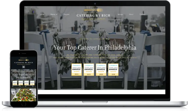
A visitor should quickly understand your services, the customers you work with, and the areas you serve. Generic claims such as “quality solutions” do not answer those questions.
For a service-area business, local relevance should come from accurate information and useful examples. Explain your coverage, describe the work you do, and link to relevant service pages. Do not imply that you have an office in every town you serve.
What to improve: make the service and audience clear near the top of the page. Add accurate coverage details and genuine project evidence. Keep business information consistent with your other online profiles.
A redesign and local SEO can work together, but they solve different problems. Better design helps visitors use the site; search visibility also depends on content, competition, technical accessibility, and other factors.
Do you need a full redesign—or a focused update?
You do not need to replace a website simply because it is a few years old. Start with the problems that affect customers and the effort required to solve them.
- A focused update may be enough when the structure works and the main issues are outdated photos, unclear wording, or a broken form.
- A redesign may make sense when mobile layouts, navigation, content, and maintenance problems are connected throughout the site.
- Review the evidence first. Compare qualified inquiries, important page visits, and form performance. Low traffic and low conversion require different responses.
Before rebuilding, record your existing URLs and valuable content. Plan redirects where URLs must change, preserve useful search information, and check forms and tracking before launch. A visual refresh should not discard the parts already working.
Website redesign South Jersey: common questions
Will a redesign automatically bring more leads?
No. A clearer, easier-to-use website can remove obstacles, but results depend on your offer, visitors, competition, and follow-up. Define what a qualified inquiry looks like and measure it before and after the changes.
Can I keep my domain and existing content?
Usually, yes. A redesign can keep your domain and reuse content that remains accurate and useful. Access, hosting, platform limitations, and any third-party licenses should be reviewed before the project begins.
How much does a website redesign cost?
The scope matters: page count, custom design, content, functionality, and migration can all affect the quote. Review our website design packages and payment options for starting points, then discuss what your current website needs.
Ready for a website that better represents your business?
HitUsUpDesigns provides website redesign for South Jersey businesses with direct, one-on-one support from Kris. Based in Gibbsboro and working remotely, we serve businesses in Voorhees, Cherry Hill, Haddonfield, and surrounding communities.
Tell us what is not working, what you want customers to do, and which parts of your current site you want to keep. We can discuss whether a focused update or a new design is the better next step.